Finch is a high-end grocery store which is about to be a great coffee place as well. Recently we collaborated together on this new project of 3 handmade pieces which hang inside the store and are available for sale.
Each piece is black and white, and goes together with a black wooden frame.
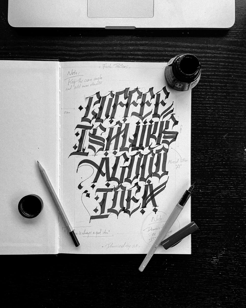
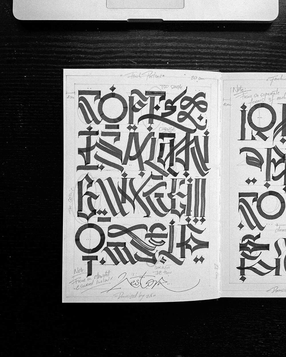
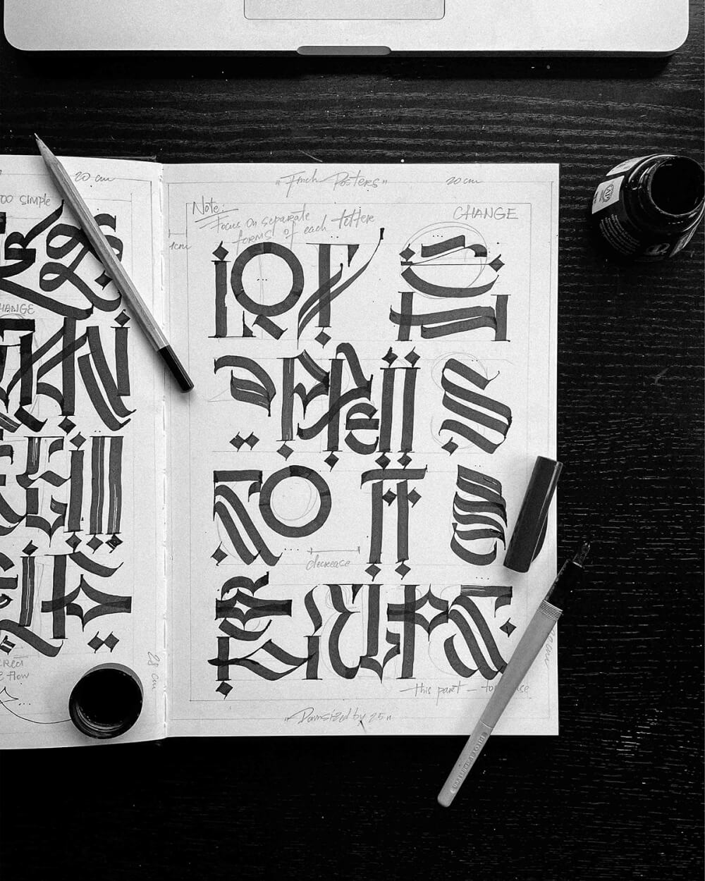
These are the initial rough sketches for this project which were made during the planning stage. The first one is something I don’t usually do — gothic type. It was done to explore more traditional way of writing letters to increase the legibility of my work. The other 2 pages are in my signature style. After that we made some adjustments together with Finch team and moved to the final production stage.
Results are shown further:
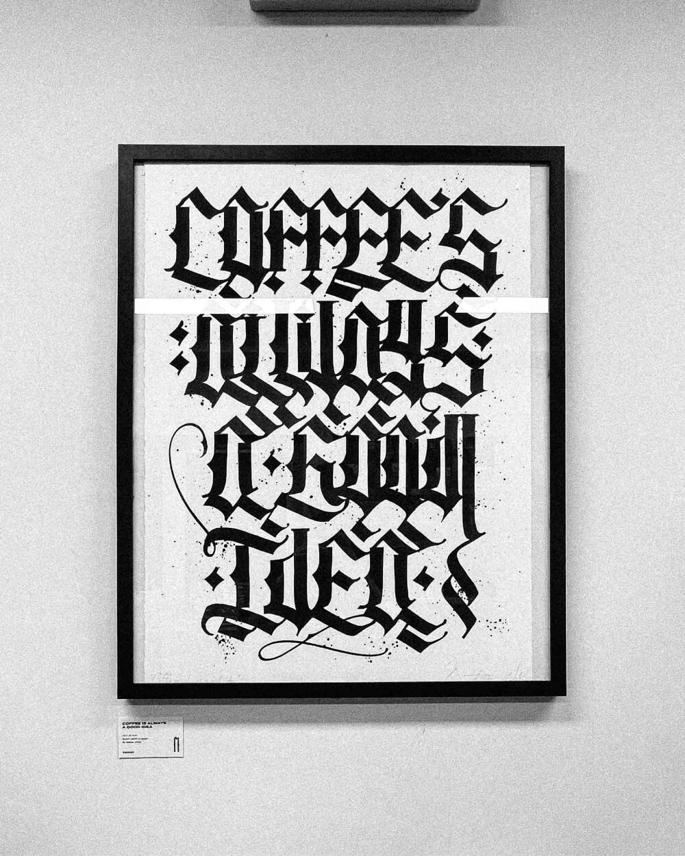
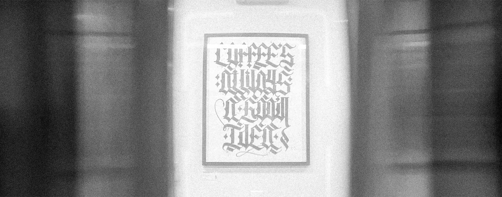
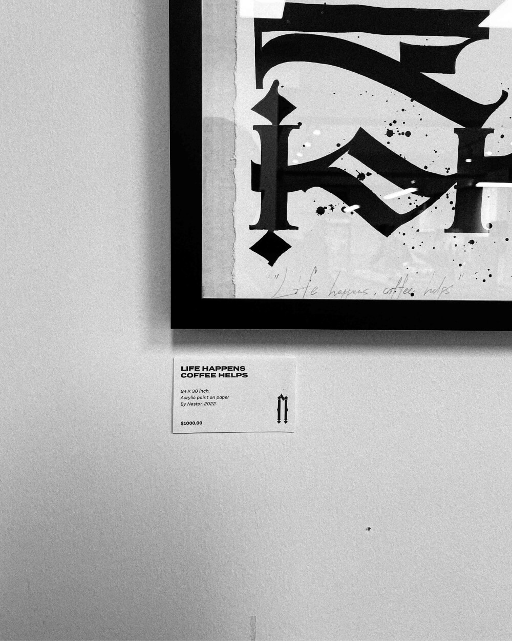
This piece is more traditional, as mentioned before. I changed the initial composition by removing the angled type and keeping it straight. It makes the letters less dynamic, however more rhythmic and symmetrical. This feature allows the viewer to read the quote easier.
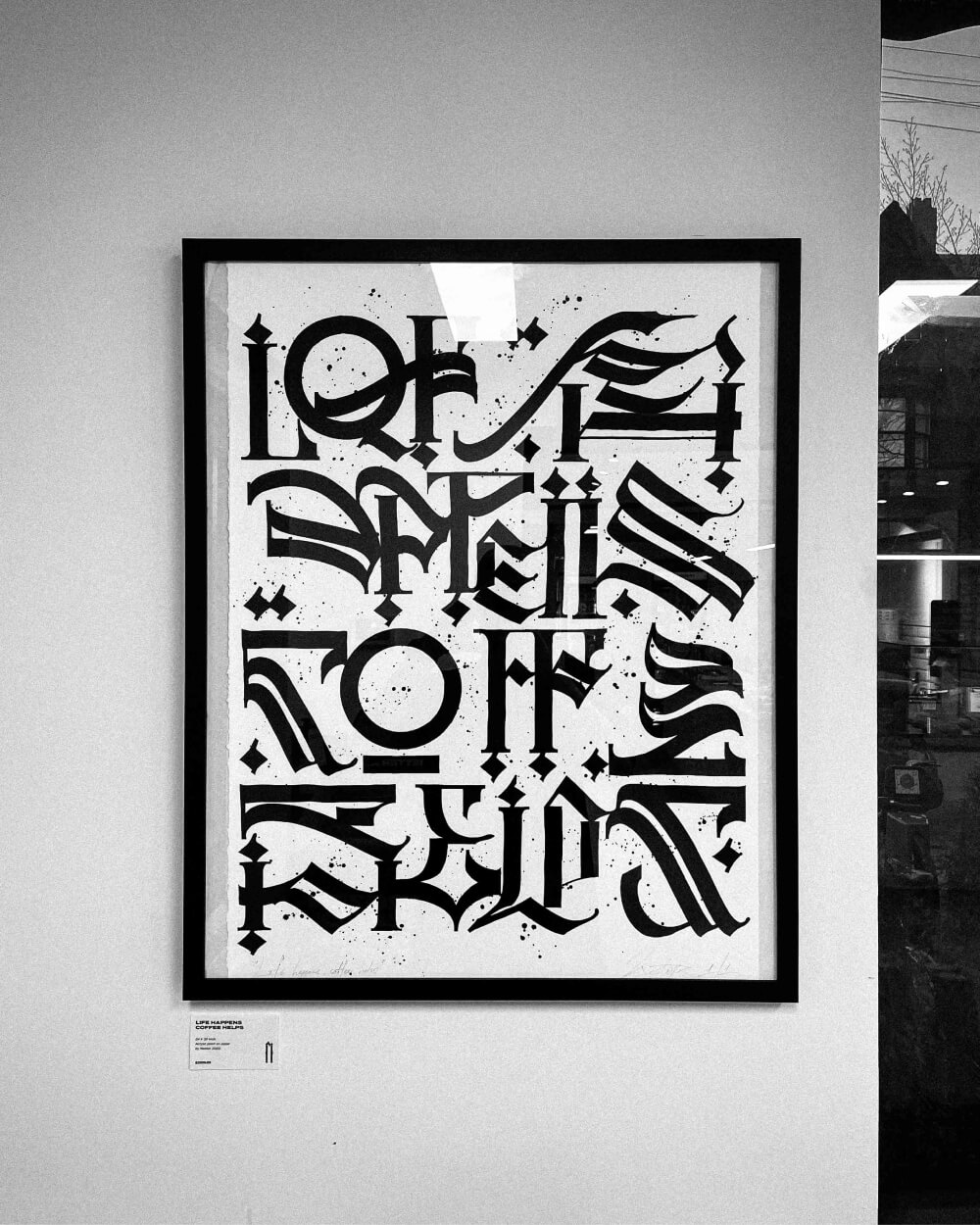
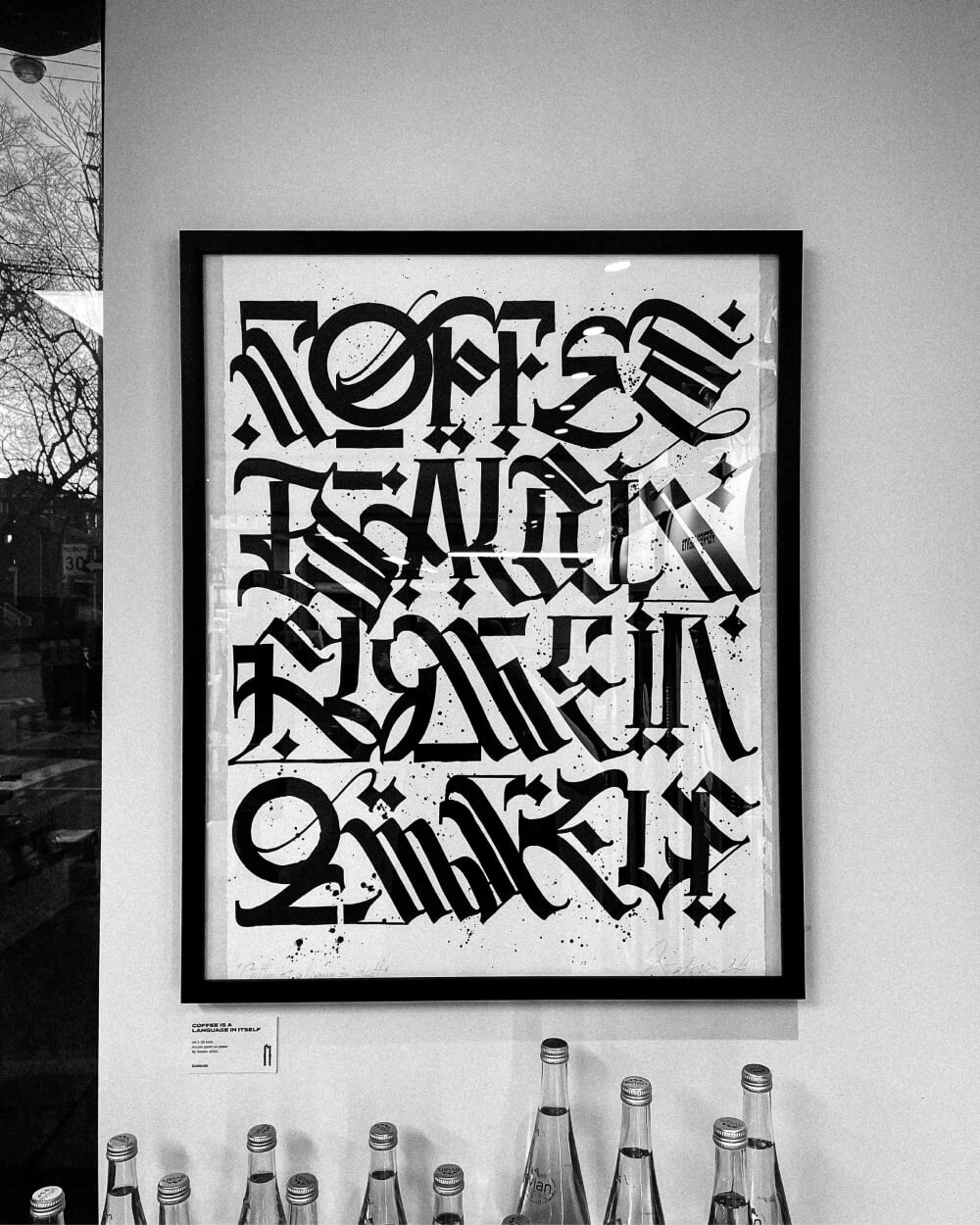
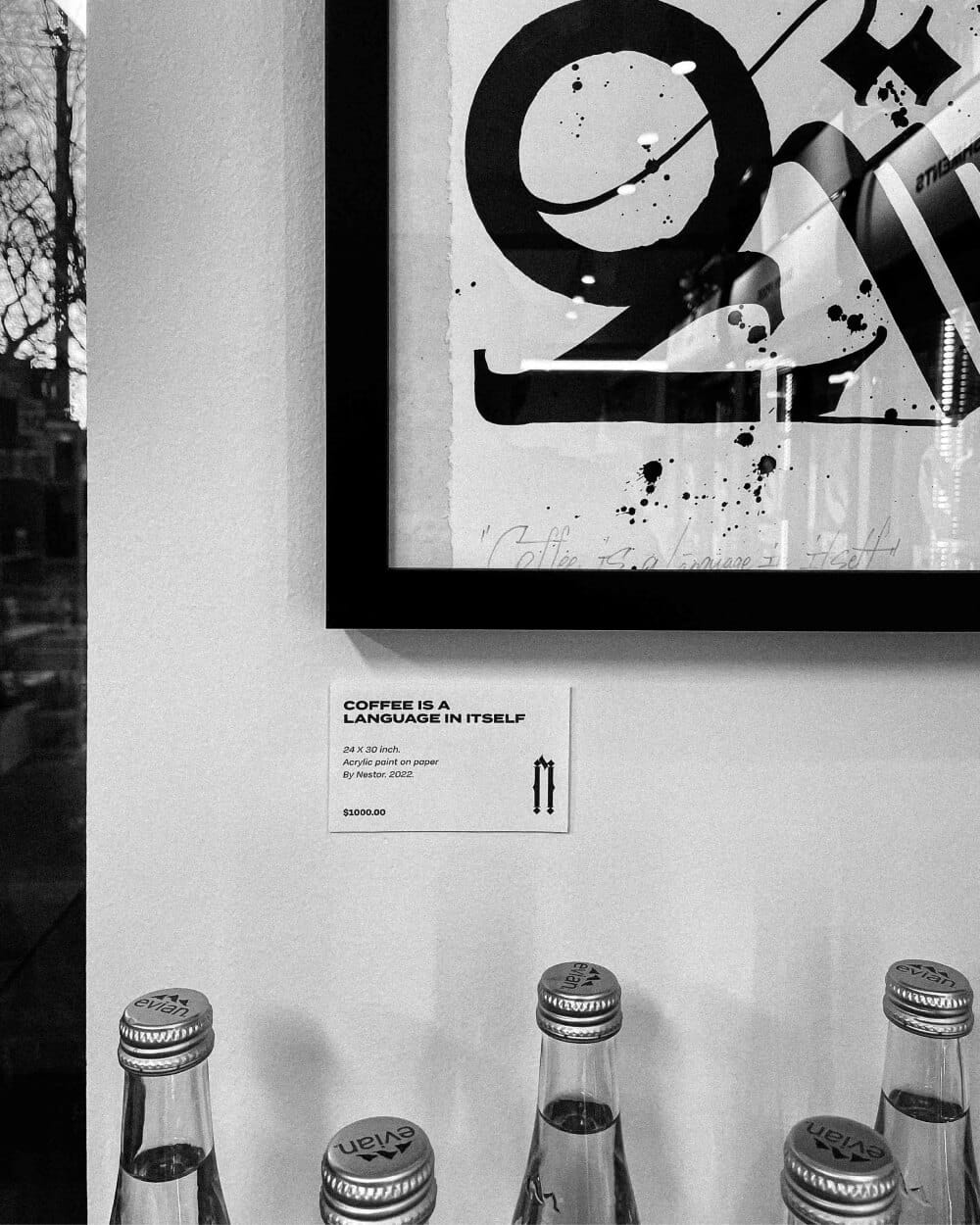
Second piece is in my signature style. I decided to space out the glyphs more, making the composition more chaotic and asymmetrical. Negative space creates more interest for the reader to decode the message hidden inside. The letters are still straight though, keeping the legibility in the work.
Last piece is in the same style as the previous work. However I changed the composition to more compact one placing the letters closer to each other. This helped me fill the whole page and create almost like a ‘wall’ of characters. Probably the least legible work out of 3 shown, but definitely my favorite due to its symmetry on the page.